Cancellation flow examples that actually reduce churn
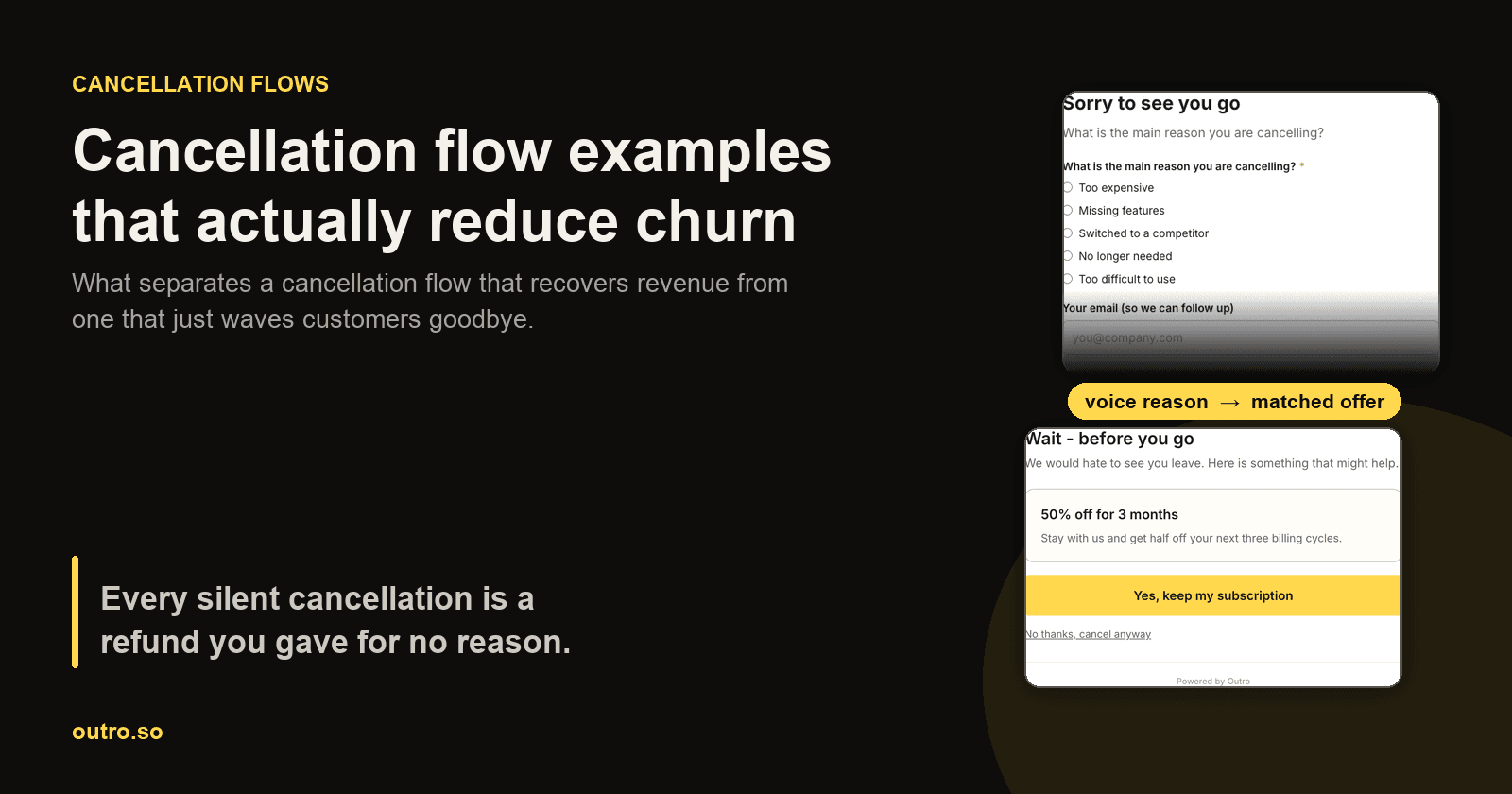
Most cancellation flows are one button and a shrug. A customer clicks "Cancel subscription", a modal asks "Are you sure?", and the subscription ends. The company learns nothing, recovers nothing, and finds out about the churn in a Stripe email the next morning.
That is a strange place to under-invest. The cancellation screen is the single moment when a customer is both maximally honest and still technically yours. They have decided to leave, so they have no reason to be polite, and they have not left yet, so there is still something to offer. A flow designed around those two facts behaves very differently from a confirmation dialog.
This article walks through the patterns that work, with screenshots of a real flow rather than illustrations of an imagined one, and the anti-patterns that cost more than they save.
What a cancellation flow actually is
A cancellation flow is everything between the customer clicking cancel and the subscription actually ending. At minimum that is one confirmation step. At its most useful it does four things in sequence. It acknowledges the decision, learns why, responds to that specific reason, and then gets out of the way.
The distinction that matters is not how many steps you add. It is whether the flow learns anything. A three-step flow that asks nothing is just friction. A one-question flow that captures the real reason and acts on it is a retention asset, and the difference in outcome is not marginal.
Two categories of churn are worth separating before designing anything:
- Churn you cannot influence : the project ended, the company was acquired, the customer's role changed. No offer helps here, and pretending otherwise wastes everyone's time.
- Churn you can influence : price sensitivity, a missing capability, poor onboarding, a bug that went unfixed, a competitor bundling the same thing more cheaply. For most self-serve SaaS this is a large share of cancellations, and every one of them is a conversation you are currently not having.
A good flow is a mechanism for telling those apart cheaply, at the exact moment the answer is available. The gap between the reason a customer states and the reason they actually left is large enough to deserve its own discussion.
The anatomy of a flow that recovers revenue
- Acknowledge, do not guilt-trip. Confirm up front that the cancellation will be honoured. Dark patterns buy a few retained subscriptions and spend goodwill you will need later, often loudly and in public.
- Ask why, briefly. One question. Not a nine-question satisfaction survey, and ideally not a dropdown, for reasons covered below.
- Respond to the reason. Match the next step to what the customer actually said, rather than showing everyone the same discount.
- Make leaving easy. If they still want out, one click. Every additional obstacle converts a neutral churn into a bad review.
Step three is where most flows fail, and it fails because of step two. You cannot respond to a reason you did not capture.
Pattern 1: ask one question, and let them answer it properly
The default is a dropdown of five reasons. It is easy to build and easy to analyse, and it produces data that is mostly wrong.
The problem is that a dropdown asks the customer to translate a specific, situational frustration into your predefined category. "Too expensive" is the socially acceptable answer, so it absorbs everything, including genuine price sensitivity but also "I never got round to setting it up and cannot justify it", "the one feature I needed was missing", and "the value was fine but my budget got cut". Those four situations need four different responses, and the dropdown flattens them into one.
Here is a real cancellation page that offers both, a structured reason and a spoken one:
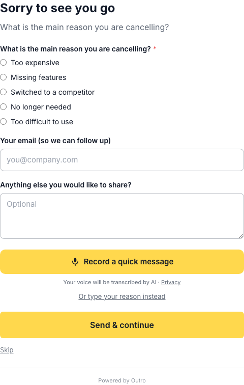
The structured radios still exist, because they make aggregate reporting easy. What changes the quality of the data is the recording option, plus the fact that Skip is visible the whole time. Nothing is required, so answering is a choice rather than a toll.
That last detail is easier to see mid-recording:
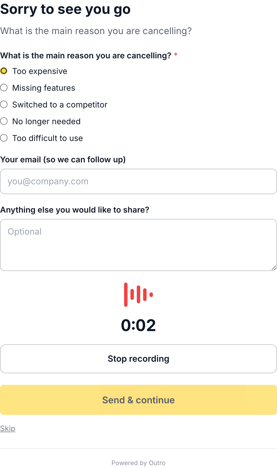
There is a live timer and a visible stop control, so the customer always knows how long they have been talking and can end it whenever they want. The Skip link has not moved. A flow that hides its exit while the microphone is on is asking for a complaint rather than an answer.
When a customer does speak, you get the situation rather than the category. In a test run for this article the spoken answer was "the price is honestly the whole problem for us, we are a team of three and the next tier up costs more than our entire tooling budget for the quarter." A dropdown would have recorded that as "Too expensive". The sentence tells you something far more actionable, which is that the pricing tiers jump too steeply for very small teams. That is a pricing-page problem, not a discount problem.
Pattern 2: match the offer to the reason
Once you know the reason, the offer can respond to it. This is the highest-leverage part of the whole flow, and it is where a generic 50% coupon does real damage.
Reason-matched means roughly this:
- Too expensive : a lower tier, an annual discount, or a temporary reduction. The objection is budget, so the answer is price.
- Missing a feature : a date if it is on the roadmap, a workaround if there is one, or an honest no. A discount does not add the feature.
- Too hard to use : a setup call or a concierge onboarding. Paying someone to keep struggling is not a save.
- Not using it : a pause rather than a discount. They do not need it cheaper, they need it later.
- Switching to a competitor : usually unwinnable in the moment, and the most valuable reason to capture accurately, because it tells you what you are losing to.
Here is what the matched offer looks like immediately after that spoken price objection:
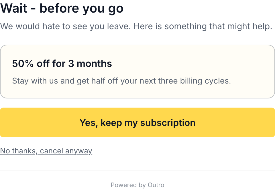
Two things in that screenshot are worth copying regardless of what tooling you use.
The offer is specific and time-boxed, not an open-ended discount. "50% off for 3 months" has a defined cost and a natural review point, where "50% off" forever quietly resets that customer's lifetime value.
And the decline path is plain text directly underneath, not hidden, not greyed out, not requiring a second confirmation. The customer who declines is going to decline either way, and the only variable is how they feel about you afterwards.
Declining leads straight to the end of the flow:

One offer, then out. No second offer, no survey, no retention specialist calling next week.
Pattern 3: pause instead of cancel
For seasonal usage, contract work, or a customer between projects, a pause is strictly better than a cancellation for both sides. The customer keeps their data and settings, and you keep a relationship that can restart without a new signup decision.
Pausing is also mechanically simple on both major billing providers. On Stripe it is pause_collection with a resumes_at date, so the subscription stays alive and stops invoicing. The equivalent exists on Lemon Squeezy as a pause mode on the subscription record.
The tradeoff is real. A paused subscription is deferred revenue rather than saved revenue, and a share of pauses never resume. It is still a better outcome than a cancellation, because a paused customer can be reminded and a cancelled one has to be re-acquired.
Pattern 4: make the downgrade visible
A meaningful number of cancellations are not "I do not want this" but "this plan is too much for what I currently need". If the only options are the current plan and nothing, you will get nothing.
Surfacing a downgrade converts a full churn into partial retained revenue. On Stripe this is a subscription item price swap, and setting proration_behavior to create_prorations keeps the billing arithmetic honest across the change. The reason this belongs in the cancellation flow rather than only in account settings is that the cancel screen is the one place you know for certain the customer is evaluating the cost.
Anti-patterns that cost more than they save
Hiding the cancel button. Beyond the goodwill damage, this now carries genuine legal exposure. The regulatory position in the United States is in flux and worth stating precisely rather than loosely: the Federal Trade Commission's Negative Option Rule, widely called the click-to-cancel rule, was vacated by the Eighth Circuit in July 2025 on procedural grounds, and the FTC opened a fresh rulemaking in March 2026. So there is no click-to-cancel rule in force today, but enforcement under the Restore Online Shoppers' Confidence Act continues and a simple cancellation mechanism is expected to be central to whatever replaces it. Designing for easy cancellation is the low-risk position in both directions.
Forcing a long survey. Completion rates collapse, and the answers you do get are shaped by irritation. One question answered honestly beats nine answered resentfully.
The blanket discount. Offering everyone the same coupon teaches your customers that threatening to cancel is how you get a lower price. It also destroys your ability to reason about churn, because you can no longer tell a price-sensitive customer from someone who simply learned the trick.
A second and third offer. If the first matched offer did not land, the second will not either, and the flow has now become the dark pattern you were trying to avoid.
Learning nothing. A flow that captures no reason produces the same cancellation twice. This is the quiet one, because it never shows up as a complaint. It shows up as a churn rate you cannot explain.
What you should be able to see afterwards
The output of a good flow is not a feeling, it is a dataset. After a set of exit interviews, the aggregate view should let you tell price churn from value churn without reading every response:
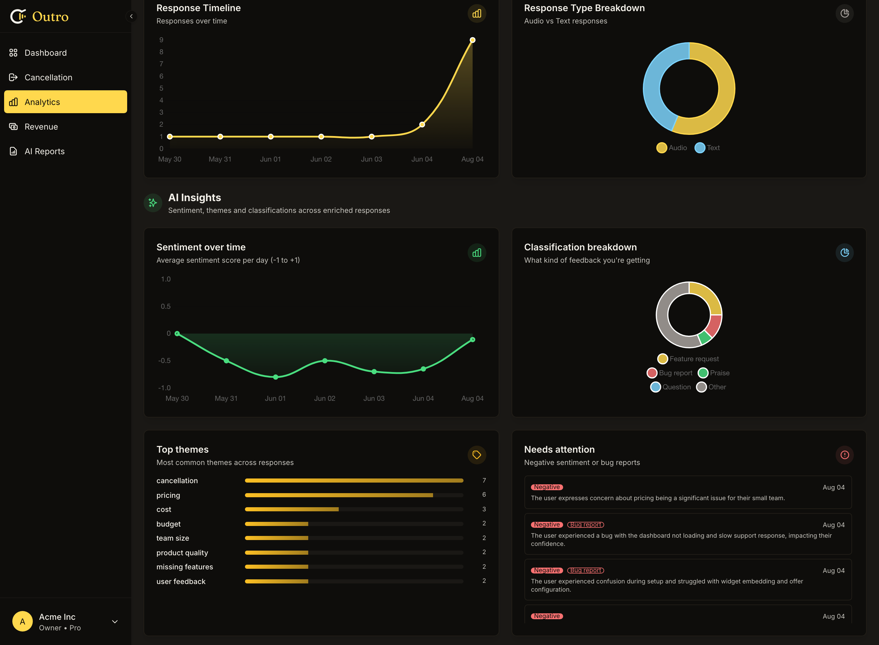
That screenshot needs one caveat. It is real output from sixteen real exit interviews on a test account, nine spoken and seven typed, so the classifications and themes are genuine. But sixteen responses across a handful of dates is a mechanism demo rather than a trend, and the slope of that line means nothing at this sample size. A real account accumulates hundreds over months, and that is when the shape becomes something to act on.
The themes extracted from those eight recordings were pricing, product quality, churn rate, onboarding, and cost justification. That list is more useful than a bar chart of five dropdown categories, because each theme points at a specific team. Pricing goes to whoever owns the tiers, onboarding goes to product, product quality goes to engineering.
Then the number that matters is recovered revenue, and it is worth checking how your tooling defines it. A save that counts the moment someone clicks "keep my subscription" will flatter you. A save that counts only after a grace period, and only if the subscription is still active, tells you something true.
A design checklist
Before shipping a cancellation flow, check that:
- The real reason gets captured, in the customer's own words rather than only as a category.
- There is one offer, matched to that reason, with a defined cost and end date.
- A determined customer can still cancel in one click, from every step.
- The confirmation of cancellation is unambiguous, so nobody is left unsure whether it worked.
- Each cancellation makes the next one more predictable, because the output is structured and aggregated.
That last point is the difference between a cancel button and a retention asset. For the wider picture beyond the cancellation moment, including the involuntary churn that no flow can address, see how to reduce SaaS churn. If you want a rough sense of what recovering even a fraction of cancellations is worth to you, the churn calculator does the arithmetic.
Common mistakes when building this
Trusting client-side parameters when fulfilling an offer. If your flow redirects back to your app with something like ?offer=discount, remember that anyone can type that query string. Before applying a discount, confirm server-side that the customer really is mid-cancellation in your own records, and cap how many times an offer can be redeemed.
Applying the offer manually and forgetting. An accepted offer that never reaches the billing system is worse than no offer, because you have made a promise and broken it. If your billing provider supports it, apply automatically. Note that Stripe can auto-apply discounts, pauses and downgrades, while Lemon Squeezy's API supports pause and downgrade but not discounts, so discounts there need a manual step you should track deliberately.
Blocking on the interview. If transcription or analysis is slow, the cancellation must still complete. Learning why someone left is your problem, not theirs, and a flow that delays a cancellation to collect data has inverted its own priorities.
Assuming the copy is translated. If you sell internationally, check what actually renders for a customer in another language. Interface chrome and merchant-configured button text are often translated separately, and a half-translated cancellation form at the worst possible moment is a bad final impression.
Where to start
If you are building this from scratch, the order that works is to capture the reason first, look at a few weeks of real answers, and only then design offers. Teams that design the offers first almost always build for the reason they assume dominates, and the recordings usually disagree.
Outro handles the capture and matching side of this, with a branded cancellation page, voice exit interviews transcribed and classified automatically, and reason-matched offers that apply to Stripe or Lemon Squeezy without blocking the cancellation. Every screenshot in this article is that flow running live.
Hear why your customers really cancel
Outro captures voice exit interviews on your cancel page, detects the real reason with AI, and shows the save offer most likely to keep them.
Start free trial