Customer exit survey: questions, templates & best practices
An exit survey is the short set of questions you ask at the moment a customer cancels. It is the cheapest churn research available to you, because the customer has already decided to leave and has no reason to be diplomatic, and they have not left yet, so you are still allowed to ask.
Most exit surveys waste that moment. They ask five questions where one would do, they force a choice between categories the customer does not recognise, and they produce a spreadsheet where most rows say "Too expensive" and nobody can tell whether that means a budget problem or a value problem.
This article is mostly templates. Each is written to be pasted into a cancellation page and edited, with a note on what it optimises for. After them comes a list of questions to leave out, and the reason each one fails.
What the survey is actually for
Two goals, and every question has to earn its place against one of them.
- Learn the specific reason : not the category, the situation. "The next tier costs more than our whole tooling budget" is actionable. "Too expensive" is not.
- Respond while the customer is still there : a relevant save offer beats a generic discount, and you cannot make a relevant offer to a reason you did not capture.
Anything serving neither goal is a tax on completion. A satisfaction matrix, an NPS score, a competitor comparison, all of it costs you answers to the questions that matter. If you have not modelled what those answers are worth, the churn calculator gives you a number to argue with.
The shape that works
One primary question, answerable by speaking or typing, everything optional, and a visible way out. Here is a real cancellation page built that way.
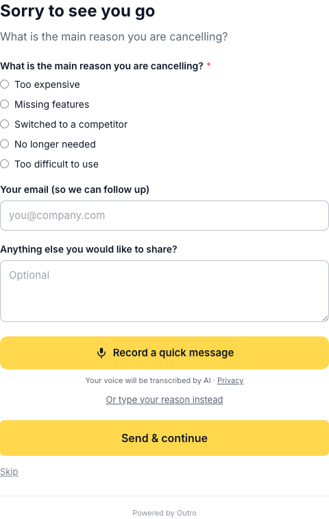
Notice what is doing the work. The five radios exist for aggregate reporting, but the record button is the primary control, and Skip is visible the entire time. Nothing is required. The consent line sits directly under the record button rather than in a footer, so nobody discovers after the fact that a microphone was involved.
That holds while the recording runs too.
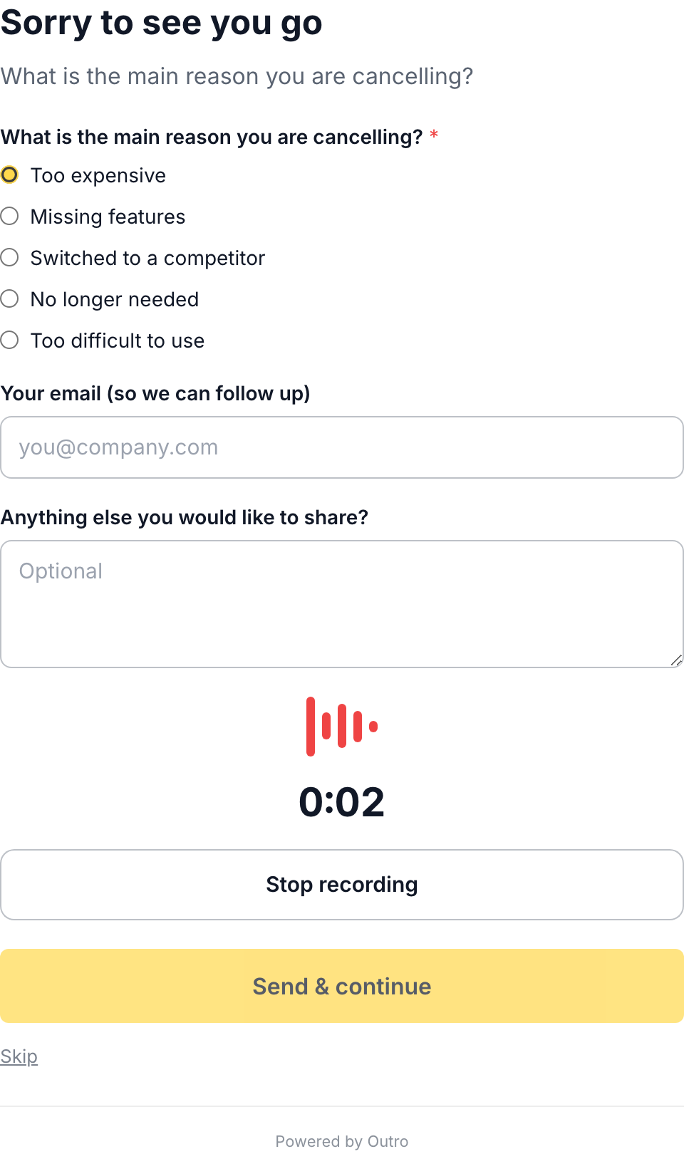
A live timer, an obvious stop control, and the exit has not moved. A form that hides its escape hatch once the microphone is on collects complaints rather than answers.
Copy-paste templates
Each template maps onto the fields a cancellation page editor typically exposes, including title, question, description, record button text, submit button, skip text, and thank-you text. Edit the wording, keep the structure.
Template 1: the minimal one-question survey
Optimises for completion rate above everything else. Use it when your volume is low, when you are adding an exit survey for the first time, or when you want a baseline before you make the flow more elaborate.
Title:            Sorry to see you go
Question:         What is the main reason you are cancelling?
Description:      One question, then you are done. Skipping is fine.

Reasons (single select, optional):
  - Too expensive
  - Missing features
  - Switched to a competitor
  - No longer needed
  - Too difficult to use

Free text (optional):  Anything else you would like to share?
Submit button:         Send & continue
Skip text:             Skip
Thank-you text:        Thank you, this genuinely helps us improve.
Keep the reason list short and mutually exclusive. Five options is enough. Every extra option splits your signal across more buckets without telling you anything new, and a list of nine forces the customer to read rather than answer.
Template 2: the voice-first survey
Optimises for depth. People say considerably more out loud than they type into a textarea, and tone carries information that a radio button destroys. Use this once your categories have stopped being useful and you need to know what is behind them.
Title:            Before you go, one question
Question:         What made you decide to cancel?
Description:      Say it in your own words. Twenty seconds is plenty.
                  You can type instead if you prefer.

Record button:    Record a quick message
Re-record label:  Record again
Consent line:     Your voice will be transcribed by AI
Fallback link:    Or type your reason instead

Email (optional): Your email (so we can follow up)
Submit button:    Send & continue
Skip text:        Skip
Thank-you text:   Thank you, this genuinely helps us improve.
Skip thank-you:   No problem. Your cancellation is confirmed.
Three details make the difference. The description sets a length expectation, so nobody freezes wondering how much is wanted. The typing fallback is visible rather than hidden behind the voice option, because some people are in an open-plan office. And the skip path gets its own thank-you message, since a customer who skipped has not helped you and should not be thanked as though they had. Turning spoken answers into structured reasons is covered in AI exit interviews.
Template 3: a product with a free tier
Optimises for distinguishing three exits that look identical in Stripe, including downgrade to free, pausing, and genuine abandonment. Use it if you have a free plan, because "cancelling" often means "still a user, just not a paying one" and counting that as churn distorts every conclusion you draw.
Title:            Changing your plan
Question:         Which of these is closest to what you want?
Description:      You will keep your account and your data either way.

Reasons (single select, optional):
  - I want to stay on the free plan for now
  - I am pausing and expect to come back
  - I no longer need this kind of tool
  - I moved to something else
  - The paid plan was not worth it for me

Follow-up (free text, optional):
  If you are staying on free, what would make the paid plan worth it?

Submit button:    Confirm and continue
Skip text:        Skip
Thank-you text:   Done. Your account stays open on the free plan.
The framing matters more than the questions. Calling this "changing your plan" is accurate for a free-tier product and removes the defensiveness that makes people click the first option and leave. The open follow-up is scoped to one situation instead of asked of everyone, which is why it gets useful answers.
Template 4: separating price sensitivity from value perception
Optimises for the most misdiagnosed churn reason there is. "Too expensive" collapses two unrelated problems, including a customer who wanted the product but could not fund it, and a customer who could have funded it but did not think it was worth the money. The first is a packaging problem, the second a product or positioning problem. A discount fixes one and insults the other.
Title:            Sorry to see you go
Question:         What is the main reason you are cancelling?
Description:      Two quick questions, both optional.

Reasons (single select, optional):
  - Too expensive
  - Missing features
  - Switched to a competitor
  - No longer needed
  - Too difficult to use

Second question (always shown, optional):
  Which of these is closer to how you feel?
  - The product was worth it, but I could not justify the spend
  - The product was fine, but not worth this price to me
  - I found the same result somewhere cheaper
  - None of these / not about price

Voice prompt:     If you have twenty seconds, tell us what the product
                  would have needed to do to be worth the price.
Submit button:    Send & continue
Skip text:        Skip
The second question is shown to everyone rather than only to people who picked "Too expensive", because Outro's form questions are a flat list with no conditional logic. That is why it carries a "not about price" option, so a customer leaving for an unrelated reason is not forced into a false answer.
The spoken prompt is doing the heavier lifting here anyway. A spoken answer usually names the specific thing the customer was measuring your price against, which is the part you need and the part no fixed option list will ever contain.
Template 5: B2B where the buyer is not the user
Optimises for a case self-serve survey copy usually gets wrong. The person clicking cancel may be an admin or a finance owner who never used the product, so asking what they hoped it would do produces a shrug. Use this for team plans and anything sold on a seat count.
Title:            Cancelling your team plan
Question:         Were you the main user of this account?
Description:      Two quick questions, both optional.

  - Yes, I used it myself
  - No, I manage the subscription for others
  - Both

Voice prompt:     If you used it yourself, what were you trying to get
                  done that this did not handle? If you manage the
                  subscription for others, what did you hear from the
                  team about why it was not working?

Reasons (single select, optional):
  - Budget or procurement decision
  - The team stopped using it
  - Missing features we needed
  - Consolidated into another tool
  - Contract or billing reasons

Email (optional): Your email (so we can follow up)
Submit button:    Send & continue
Skip text:        Skip
Thank-you text:   Thank you. If you are open to a short call, reply to
                  the confirmation email.
Separating those two audiences is the whole point. An admin can tell you about procurement, seat utilisation, and internal politics, and cannot tell you much about the product. A user tells you the opposite. Asking both groups an identical question guarantees half your responses are secondhand guesses.
Since the form is a flat list rather than a branching one, the role question and the voice prompt do that separation between them. The prompt names both cases and the customer answers the half that applies to them, which a person reads past in a second. If you would rather keep the prompt short, run two cancellation pages instead, one linked from the admin billing screen and one from the in-app account screen, and give each its own wording. Page count is plan-limited, so check your tier before relying on that.
Questions not to ask
- "What could we have done better?" : it asks the customer to design your product for you. Most people have no answer and will type "nothing" or leave. Ask what they were trying to do instead.
- "Was the product too expensive or missing features?" : double-barrelled. Any answer is ambiguous because you cannot tell which half it responded to.
- "Do you agree the price is fair for the value provided?" : leading, and it invites a polite yes from someone leaving precisely because they disagree.
- "Which of our 14 features did you use?" : product analytics wearing a survey costume. You already have this data, and asking burns the attention you needed for the reason question.
- "How likely are you to recommend us?" : an NPS score from a churning customer measures nothing you can act on, and it signals that you care about your dashboard more than their problem.
- "Which competitor are you switching to?" as the first question : it reads as competitive intelligence gathering rather than an attempt to help, and it caps the honesty of everything after it. Ask it last, optionally, or not at all.
- Anything mandatory : a required field converts people who would have answered honestly into people who pick the first option to get past the screen. Forced answers do not just add noise, they add confidently wrong noise.
The copy around the question
The question gets the attention, but the surrounding copy decides whether anyone answers it. Four things to get right.
- The consent line : if you record audio, say so at the point of recording, in plain language, not in a linked policy. "Your voice will be transcribed by AI" is the whole sentence.
- The skip label : name it "Skip", not "No thanks, I do not care about improving the product". Guilt-worded skip links are the most reliable way to earn a public complaint.
- The submit label : "Send & continue" tells the customer that submitting does not trap them in another step. "Submit" leaves them guessing.
- The thank-you state : short, specific, honest about what happens next.

One sentence, no upsell, no survey about the survey. If you promised a follow-up when you asked for an email, this is where you say when it arrives.
What the answers look like once they are classified
Raw transcripts are readable up to a few dozen. Past that you need the same answers in two forms, individually and aggregated.
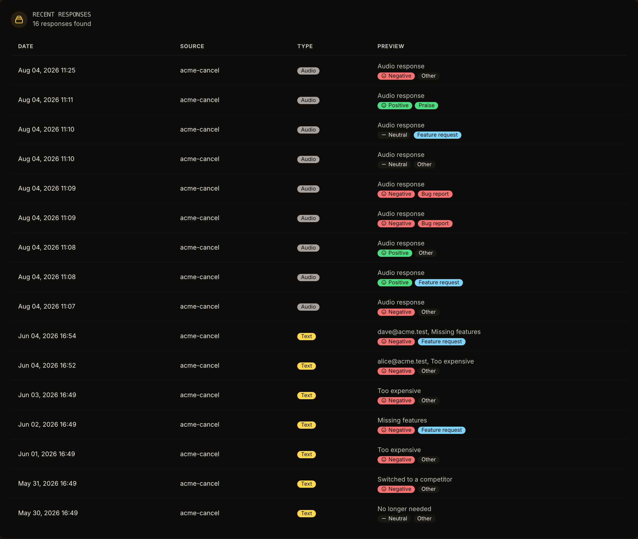
Two separate classifications are at work here, and conflating them is a common analysis error. A churn reason answers why the subscription ended, and in Outro that lands in a fixed set of seven values stored as the identifiers too_expensive, missing_features, not_using, too_complex, technical_issues, switching and other. A feedback classification answers what kind of message this is, across bug report, feature request, praise, question and other, alongside a sentiment of positive, neutral, or negative. A response can be praise with a negative sentiment and a churn reason of too expensive, and that combination tells you something.
Aggregate view of the same data.
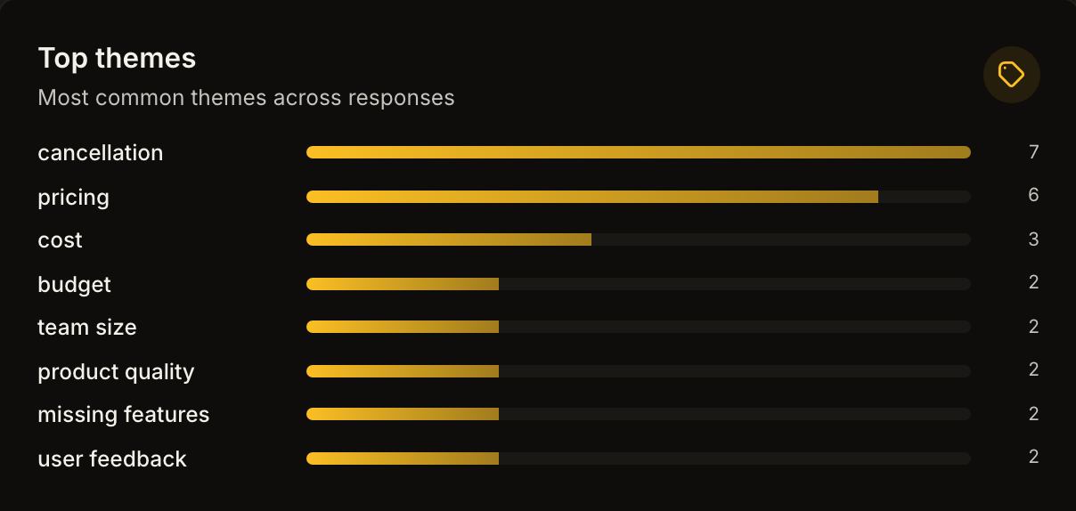
Read that chart with the sample size in mind. It covers sixteen responses on a test account, so the ordering is illustrative rather than a trend, and the same caveat applies to your own first month. Theme charts get meaningful somewhere in the low hundreds of responses. Before that, individual transcripts beat the bars.
Getting data out is deliberately simple. Outro sends a weekly digest email on Mondays and offers CSV export. There is no public API, no webhooks, and no Zapier or Slack integration today, so piping responses into a warehouse is a CSV job rather than a stream.
Writing for an international audience
If your customers are not all English speakers, one detail changes how you write the templates above. Outro transcribes and translates spoken input in 30+ languages, and separately offers its interface in 7 reading locales, including English, French, Spanish, German, Portuguese, Japanese, and Chinese. Those are different features.
The gap is that the copy you configure, meaning your title, question, and button labels, is stored in a single language, while Outro's own interface chrome is translated. A French-speaking customer landing on an English-configured page therefore sees a partly English form. So write the configured copy in the language most of your paying customers actually read, keep sentences short and free of idiom, and run a separate cancellation page per market if the split matters. The page slug is configurable, so a second page per language is a copy-and-edit job rather than an engineering one. How many you can run is plan-limited, so a genuinely multi-market setup is not something the entry tier supports.
Spoken answers are unaffected. A customer can answer in their own language regardless of the language your form is written in, which is a good reason to lean on the voice question rather than the radio list for an international base.
Common mistakes
- Asking by email the next day : recall decays within hours, and you lose everyone who never opens the email, which is most of them. Ask at cancellation.
- Treating the survey as an archive : a reason code filed in a spreadsheet nobody reads is not research. Read responses weekly and decide something.
- Reacting to single responses : one articulate customer describing a missing feature is an anecdote. Six describing the same gap is a roadmap input. Hold the line between them.
- Offering the same discount to everyone : a discount aimed at someone who left because of a bug tells them you were not listening. Match the response to the reason, or offer nothing.
- Adding friction and calling it a flow : extra steps that ask nothing are dark patterns with a survey label attached. The cancellation flow examples piece covers where that line sits.
- Optimising for completion rate : 90 percent completion on a question producing unusable categories is worse than 40 percent on a question producing sentences.
- Not checking involuntary churn first : if a meaningful share of your cancellations are failed payments, no survey wording helps and the fix belongs in dunning. That and other structural causes are covered in how to reduce SaaS churn and why SaaS customers cancel.
Where to start
Pick Template 1, ship it, leave it alone for a month, and read every response. When you find yourself unable to tell two different situations apart from the categories, which usually happens inside a few dozen responses, move to Template 2 or Template 4 depending on which distinction is hurting you most. Adding a voice question to a survey nobody answers fixes nothing. Adding one to a survey with a clear blind spot fixes a lot.
The screenshots above are the actual Outro product, not mockups. Outro replaces the cancel button in a self-serve Stripe or Lemon Squeezy subscription with a short spoken question, transcribes and classifies the reason, and shows the save offer most likely to fit before the cancellation completes. Audio is transcribed on the fly and not stored. Plans run from a free tier at $0 through Starter at $29 per month, Pro at $79, and Scale at $199, with custom branding and logo on Pro and Scale. If you only take the templates and paste them into whatever you already use, that is a fine outcome too.
Hear why your customers really cancel
Outro captures voice exit interviews on your cancel page, detects the real reason with AI, and shows the save offer most likely to keep them.
Start free trial